Welcome to the ThemeZee Social Sharing plugin documentation. These instructions briefly explain how to setup and configure all plugin features.
Table of Contents
Install Plugin
Since it is the same procedure for every plugin, this tutorial does not explain how to install the plugin. If you need help with the plugin installation, please see the Install WordPress plugins tutorial.
The Social Sharing plugin is available to all purchasers of our Pro Add-ons and Bundles and can be downloaded at any time in your account.
Activate License
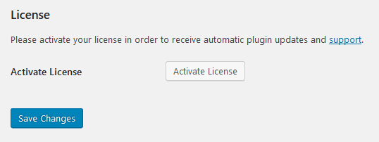
After you have installed and activated the plugin, please go to Settings → ThemeZee Plugins → Social Sharing and activate your license key to receive regular updates.

Configure Plugin Settings
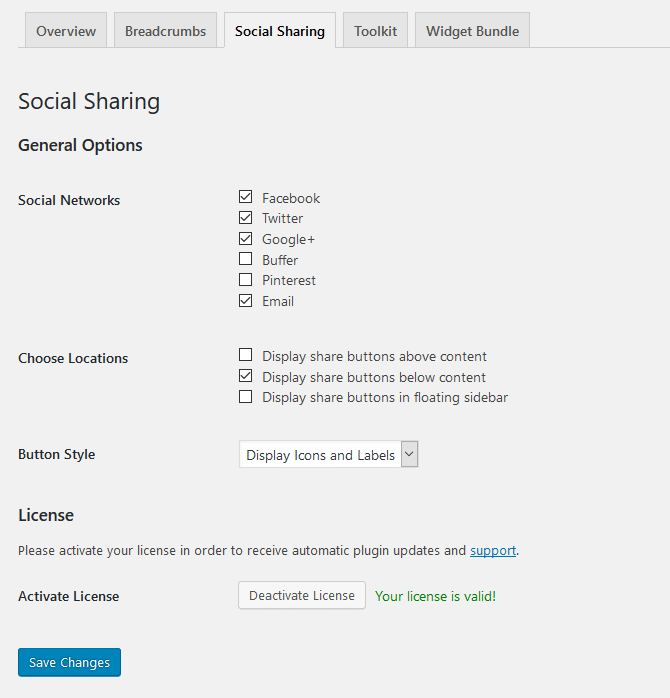
The Social Sharing plugin comes with a bunch of settings which allow you to adjust the social sharing feature to your needs. You can configure these settings on Settings → ThemeZee Plugins → Social Sharing.
The Social Networks setting let you choose which sharing buttons should be displayed. Furthermore you can select the exact locations where the sharing icons should appear.
The plugin supports three different button stylings by default: Icons, Labels or Icons + Labels. Please look at the next section of this tutorial for more available styling customizations with CSS.

CSS Customizations
You can change the styling of the social sharing buttons with CSS code if you want. The following CSS snippets help you to get started.
You can add your own CSS snippets to your WordPress website by using the Simple Custom CSS plugin.
Square Buttons: CSS removes rounded corners
.tzss-content .tzss-button {
	-webkit-border-radius: 0;
	-moz-border-radius: 0;
	border-radius: 0;
}
Round Buttons
.tzss-content .tzss-button {
	-webkit-border-radius: 25px;
	-moz-border-radius: 25px;
	border-radius: 25px;
}
Button Spacing
.tzss-content .tzss-share-buttons-list .tzss-share-item {
	padding-right: 5px;
	padding-bottom: 5px;
}
Button Size
.tzss-content .tzss-link {
	padding: 4px 8px;
}
Change Color of all buttons
.tzss-content .tzss-share-buttons-list .tzss-button {
	background: #22aadd;
}
Button Hover Color
.tzss-content .tzss-link:hover,
.tzss-content .tzss-link:active,
.tzss-content .tzss-link:focus {
	background: rgba(0,0,0,0.2);
	background: #444;
}
